Monday, 19 December 2011
cadbury occipital lobe cell


Coca Cola

Here i have drawn an anatomical illustration by Versalius and i have adapted it to highlight where recognition happens in the brain and the red symbolises the red of coca cola, showing that this colour has become iconic through coca cola's use of advertising and the constant appearence of it in advertising due to the brands fame.
Sunday, 18 December 2011

Cadbury colour

Cadbury dairy milk purple


This idea ilustrates how pervasive the properties such as colour in advertising can be to the individual.
Friday, 16 December 2011


Thursday, 8 December 2011
Bounty

bounty advert


my advert
Again there is no apparent link between the car and the chocolate bar
Recent Cadbury Ads

http://www.youtube.com/watch?v=TVblWq3tDwY&feature=relmfu

http://www.youtube.com/watch?v=TnzFRV1LwIo

http://www.youtube.com/watch?v=7U41lKOHsyI&feature=relmfu
Using these adverts Cadbury steps away from pushing the product through traditional advertising means and instead produce 'entertainment pieces' which appeal to a broader range of consumers and spread through viral marketing. The creative idea was 'founded upon the notions that all communications should be as effortlessly enjoyable as eating the bar itself'.
Flake

Instead of just looking into the font and typeface of a brand i am going to look into how food products are presented to us, how they are advertised and how we as consumers interact with this. I am particularly interested in the relationship between a product (mainly food) and the advert that goes with that product, as there is sometimes irrelevance between the two. For instance the recent Cadbury ads which draw no link between the product and adverts and yet they work, more people are buying Cadbury more than ever.

James Rosenquist


James Rosenquist started as a bill board painter and applied the sign painting techniques to large scale paintings he begun creating in 1960. He adapted the visual language of advertising and pop culture to the context of fine art. Rosenquist has described his paintings as being meaningless reflecting advertising in general. What we see on an advertisement is not reality it is a hyper reality and something that is unattainable. Rosenquist is emphasising this through his large scale bill board like paintings.


Friday, 25 November 2011
Changing a font

When we go food shopping we enter the environment with certain expectations of the products on the shelves. Every single packaged product has a logo which in turn has its own font and typeface. Although we may not realise it we make a judgement on a given product which partly relies on the font of that product. When a font changes on a product the sales for that product fluctuate, either increasing or decreasing showing that the font clearly has a large causal role in determining sales. When a product changes its logo or font I immediately treat it with scepticism. Why has the company chosen to change the type, colour etc? I realise that this may seem very conservative and I would like to see how other people feel on this matter. So my first intention is to experiment with changing the fonts of well known food brands such as Heinz banked beans and Hovis bread and try to understand why some fonts do not work on certain products and some do, why colours play an important role in our expectation of a product and how our expectation of a product may change when the type or design changes. My second intention is to somehow distribute the new designs of various food brands back into the supermarket with the intention that the customers will look at them and i will try to observe there behaviour. I will distribute them evenly on the shelves so that some will be on show and some will be hidden. Through doing this i am understanding the huge role that type and design have on controlling our consumer desires and how fickle we as consumers can be.
What is Typography?
If we were to consider the normal everyday activities that consume our lives, it would quickly become apparent that typography is ubiquitous and inescapable. for the most part, this material is routine and boring. but it is also, for the most part essential.
Typography has been traditionally associated with design and in particular with the printing industry. However owing to the universal access to digital technology, the word 'typography' is increasingly used to refer to the arrangement of any written material and is certainly no longer restricted to the typographer...-David Jury
Typography and typefaces are key visual elements of developing an appropriate tone. Type selection is first and foremost dictated by the needs and identity of the piece/product being developed.

Although I do not intend to use the coca cola type in my work I think it is important to research this as it is so iconic and recognisable. The first coca cola logo was designed by Frank Mason Robinson in 1885. Thinking that the two C's would look well in advertising, it was John S Pemberton (the drinks inventor) who came up with the name and chose the logos distinctive cursive script. The type face used known as spencerian script was developed in the late 19th century and was the dominant form of formal handwriting in the United States during that period. The red and white coloured scheme in the Coca Cola logo was kept simple and distinctive to lure young minds. I think that by using this typeface for Coca Cola which was the formal way in which people wrote was an extremely clever use of design. The consumers recognised this type, many of them would have written in this way therefore this product would have fitted nicely in their lives. Nowadays the cursive script style of handwriting isn't used by as many people however the Coca Cola type is still relevant, it remains timeless.

The evolution of the Cadbury logo
Change in conceptual direction
I have decided to change the subject matter of my project from the project orientated around lifespace.cc. I feel that i have exhausted my interest in it however the research made from this project will power my new project.
The work of Cildo Merelies has influenced me greatly by applying images and messages onto various items that were already widely circulated and which had value discouraging them to be destroyed such as banknotes and coca cola bottles (which were recycled by way of a deposit scheme).
My initial idea with lifespace.cc was to get my message onto the site and i did this though a blog however i felt that this was not enough and not enough people were seeing the message through my work. So i have chosen to change the theme of my project but keeping my initial intention which is to covertly distribute a message into a consumer product that is out of place with the usual style of advertisement.
Typography
I intent to convey my message through the medium of typography, a technology. The advertisements of products relies heavily on iconic styles and typographies. When we go to the shops we are bombarded with these iconic styles that we hold in our cultural memory. We have certain expectations of a product through its advertisement design. Why is a certain stye of type used on a loaf of bread and another style used on a can of beans? How would our expectations of a product change if the type didn't match the product? How and why wouldn't a style match a product? These are questions that i want to look in to.
Wednesday, 9 November 2011
Reflective Review
My main concern for Coursework 1 and my aim has been to convey how peoples religious beliefs can be manipulated to make money and how easy it is to take advantage of those peoples cherished beliefs for monetary gain. I am not religious but I am interested in exploring why people may have religious beliefs and how those beliefs can be maintained in a secular society where logical analysis and scientific methods are so dominant. Through joining the christian social network Lifespace the first thing that caught my attention was the amount of products that are for sale and most of the products claim that if bought, would bring you closer to God.This seems to contradict the teachings of Jesus who was said to view the market place and money with great suspicion. The notion of a virtue gift seems bizarre to me, starting off at $5 this is an image you send to a friend for a particular occasion like an image of a birthday cake, and I find it concerning that these virtual gifts are actually bought by members of the site, under the illusion that virtuousness from God can be bestowed through buying it with money.
I found the Postmodernism exhibition at the V and A hugely inspiring and I saw several works that were new to me. In particular the collage and appropriation design stood out to me and I have used these techniques in my own work; these are appropriate mediums for stressing my point. My main aim was to create a piece of work reflecting the wrong doings of lifespace and put it onto the actual lifespace site in a form that was not obviously derogatory and thus would not be removed. It would act as a form of anti-advertisement to those with a keen eye.
I managed to put several different designs on to the website under a blog that I created and I was very pleased to have been able to do this.
I may develop this project further under the same general idea of corruption and fraud using beliefs. The idea of creating a piece of work which appears as one thing but means something different intrigues me as in this context it has the effect of being a process of illustrative subterfuge, whereby the actual meaning of the illustration can be hidden under a layer of false and apparently obvious meaning.

Cildo Meireles's zero dollar bill


'Zero Dollar' is one of Meireles' signature works where he uses a subversive strategy of distribution to communicate his message. By ascribing the value of zero to a reproduction of a U.S dollar bill Meireles strips the symbol of economic dominance of its power. Meireles sold some of the zero dollar bills and in rio tried to give them to a street vendor who was in fact part of an operation to stop him from distributing them, subsequently the police were involved. "But the idea was to produce an object and then try to put this object into circulation which causes the object to provoke a kind of shift in anthropological behaviour" -Meireles.
Tuesday, 8 November 2011
Magpies 2

I think this image works better in representing lifespace.cc. I like how the important figures of American history on the dollar bills match to the heads of the magpies, it adds a human quality to the animal.
Sunday, 6 November 2011


Magpies

The magpies here are depictions of the people who run lifespace.cc and i have chosen to transform them into magpies to symbolise the theft that takes place on the social network through the scam of the virtue gifts and the constant bombardment of advertisements all of which are demanding money. The head on the left is of a random person i found on google images and the head on the right is Minister Donald A Davis a member of lifespace. I am going to develop this image and put it onto lifespace.cc under the guise of it being a positive meessage for lifespace, however what the image will truly represent is the immoral acts that happen on the social network and the relationship that lifespace has with money.

Here i have added shiny trinkets that magpies are attracted to and also the lifespace slogan.
Sunday, 23 October 2011
Appropriation

Here i have added a one hundred dollar bill on the bottom of a medieval painting, symbolising lifespaces' relation with money and religion.

Saturday, 22 October 2011
First Collage

There are several different elements in this collage which i have chosen in order to symbolise the christian social network within an image. The main feature being the repeated man praising Jesus, i used this image twice in order to emphasise his passion and the baby is to symbolise how children can be indoctrinated at a very early age before they can have any considered religious views. The magpie symbolises the stealing of money that i feel the christain social network does with 'virtual gifts'. The half dollar bill emphasises this and symbolises that the social network is from America. I have included the strap line of the social network as i think it is quite bizarre and may make the viewer think as to what this image is about and wheather it is a postive or nagative one.
Wednesday, 19 October 2011
lifespace-a place for friends and family
I thought it would be wise not to use my real name and information when joining the Christian social network so i made up a profile under the name of 'Trish'. The profile picture is of the most conservative woman i could find on google.The image that dominates the home page is of a book entitled '4 Keys to Hearing God's Voice'. This book costs $12.95, however before buying this book you are advised to take a ten week course costing $20 per family or $10 per person. Or you can buy a guaranteed package costing $175. It doesn't surprise me to see this network asking for money before the user has even signed up, for me this sums up what many religious websites and religious social networks are about.
http://www.cwgministries.org/store/4-keys-hearing-gods-voice-book - 4 keys to hearing God's voice
http://lifespace.cc/profile/CharlotteWhiston?xg_source=activity#add_comment - my page
http://lifespace.cc/ - home page
http://www.cwgministries.org/store/4-keys-hearing-gods-voice-book - 4 keys to hearing God's voice
http://lifespace.cc/profile/CharlotteWhiston?xg_source=activity#add_comment - my page
Project Outline- "LifeSpace-Christian Social Network Like MySpace or Facebook"
The social network that i have joined is called 'LifeSpace-Christian Social Network Like MySpace or Facebook' (this is the actual name!) or 'lifespace.cc'. I am not religious and enjoy having debates with people on the subject of religion in particular christianity. My work sometimes includes this theme and i think that by joining a christian social network i can observe how some of the people can be extremely prejudiced and merciless through the blogs and discussions they hold and i would ultimately like to make a piece of work that reflects this. Ideally the work that i produce will at first glance appear like a positive message for the christian social network but with the knowledge of what the piece/s is about it will be clear that the message behind the piece/s illustrates the indoctrination and exploitation of these religious social networks.
Saturday, 15 October 2011
Post Modernism At The V and A
Style And Subversion 1970-1990
Post Modernism was perhaps the most controversial of the design movements and defies definition. Post modernism was a drastic departure from Modernisms utopian visions which were based on clarity and simplicity contrasted to the complexities and contradictions of Post Modernism. It shattered established ideas about style, it had the freedom to design which often resulted in confrontation but brought a new self awareness about style itself, however later on Post Modernism became emursed in the very circuits of money and influence that it had originally sought to dismantle.
Before seeing the exhibition (Post Modernism Style and Subversion) I didn't realise all of the traits that were associated with the art movement like bricolage, collage, appropriation, performance art etc.
 I found the work of Peter Saville's particularly interesting. His output from the Post Modern movement included appropriation from art and design. Design critic Alice Twemlow wrote "...in the 1980's...he would directly and irreverently "lift" an image from from one genre -art history for example- an recontextualize it in another. A Fantin-Latour 'Roses' painting in combination with a colour coded alphabet became the seminal album cover for New Orders 'Power Corruption and Lies' (below)
Savilles design for Joy Divisions album cover 'closer' (above) released shortly after Ian Curtis' suicide (1980) was controversial as it depicts an image of christ's body entombed, however the album design pre dated Curtis' death.
This is why i find this form of design intriguing as taking an image from another genre or era makes the viewer judge the image within their own subjective context. The meaning one gets from the image can be completely contrasted to how another would view it. Saville was one of the first designers to use this technique so blatantly, relying on only the 'borrowed' image for the art piece, this can be seen as a risky thing to do opening this style up to criticism from previously embedded art movements.

 The great mirror of the dance as an
immolate sacrifice 1986


Post Modernism was perhaps the most controversial of the design movements and defies definition. Post modernism was a drastic departure from Modernisms utopian visions which were based on clarity and simplicity contrasted to the complexities and contradictions of Post Modernism. It shattered established ideas about style, it had the freedom to design which often resulted in confrontation but brought a new self awareness about style itself, however later on Post Modernism became emursed in the very circuits of money and influence that it had originally sought to dismantle.
Before seeing the exhibition (Post Modernism Style and Subversion) I didn't realise all of the traits that were associated with the art movement like bricolage, collage, appropriation, performance art etc.

Savilles design for Joy Divisions album cover 'closer' (above) released shortly after Ian Curtis' suicide (1980) was controversial as it depicts an image of christ's body entombed, however the album design pre dated Curtis' death.
This is why i find this form of design intriguing as taking an image from another genre or era makes the viewer judge the image within their own subjective context. The meaning one gets from the image can be completely contrasted to how another would view it. Saville was one of the first designers to use this technique so blatantly, relying on only the 'borrowed' image for the art piece, this can be seen as a risky thing to do opening this style up to criticism from previously embedded art movements.

Tadanori Yokoo was a pioneer of Post Modernist appropriation and bricollage. All of his works display a unique visual richness alluding to an electric array of artistic movements and images such as Surrealism, Dada, Russian Construcavism, American Pop Art, Contemporary Japanese Popular Culture and traditional Japanese art forms. The art critic Yasushi Kurabayashi wrote, "Yokoo's posters are not designed around conventional poster-like ideas. Rather his posters have been executed from his own desire for creative expression, with little regard for cognitive clarity or message"

immolate sacrifice 1986

A la Maison de m civecawa (to the shibusawa house) 1965
Modern and Post Modern Graphic Design
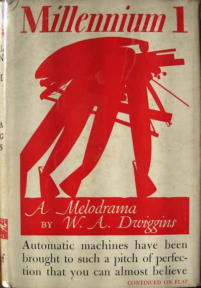
Post Modernism didn't have much impact on graphic design until the 1980's. Initially many designers thought it was just an undisciplined self-indulgence, a hodgepodge of styles with no unifying ideals or formal vocabularies, but in fact it was a new way of thinking about design, one that instigated a new way of designing. Although Jan Tschichold (below) has been celebrated as an early proponent of modernist asymmetric typography, (many designers see his body of work as an important precedent for todays postmodern typography in that it represents diversity in ideology and style) another important precursor to post modernism was W.A Dwiggins.

Dwiggins (below) was a tireless experimenter with form who took inspiration from eastern cultures, history and new technology. Unlike Tschichold, Dwiggins never embraced the Modernist movement nor was he defied by it. However he was absolutely commited to being a modern designer. Both Dwiggins' and Tschichold's work was initially misrepresented with Tschichold being celebrated as a modernist typographer which downplayed his more substantial body of design and writing based on traditional and classical ideas and Dwiggins being represented as a traditional designer in spite of the innovative and experimental nature of most of his work. It has only been in recent years that discussions of both designers have expanded to include the full scope and plurality of their work.
This is because the Postmodern context has encouraged diversity and complexity and the line dividing modern and classical, good and bad, new and old has become very blurry and fractured. In the late 1980's an anti-aesthetic impulse emerged in opposition to Modernists 'good design', a reaction against the narrow and formalist concerns of late Modernism. The new aesthetic was impure, chaotic and crude and was so successful that, in terms of style pretty much everything was allowed in the professionalized filed of graphic design and typography would also go along with this.

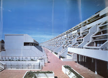
By the mid eighties Paula Scher had become known as a designer producing original and inventive work which often reflected the past. The Swiss watch company Swatch asked Scher and her business partner Terry Koppel to help promote the Swiss watch company. They were asked to develop a campaign that was reminiscent of American 1950's advertising.
Swatch's head quarters was in the Swiss international business building where upon the walls hung the work of Swiss designer Herbert Matter. His style was fresh using contrasting photos, typography and colour he developed a series of powerful posters for the Swiss National Trust Office (Above). Fifty years later Scher held admiration for these pieces and decided "They were all crying out for a swatch watch". The poster had to have some of the elements re-created. The lady in the ski hat was a reshot at a different angle, with the title changed and made bigger and the arm dropped in.
Designers were beginning to push aside context and look at things through a narrowing view of retrospect and nostalgia.
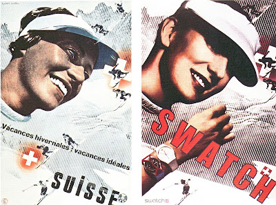
But does Paula Scher get away with this design because she is Paula Scher, because of her reputation, because she was one of many doing it? What role does design history play for us today? I want to question and investigated this myself through this project as appropriation played a big role in post modern design and is one that i feel drawn to.
Subscribe to:
Posts (Atom)