Style And Subversion 1970-1990
Post Modernism was perhaps the most
controversial of the design movements and defies definition. Post modernism was a drastic departure from
Modernisms utopian visions which were based on
clarity and simplicity contrasted to the complexities and contradictions of Post Modernism. It
shattered established ideas about style, it had the
freedom to design which often resulted in confrontation but brought a new
self awareness about style itself, however later on Post Modernism became emursed in the very circuits of
money and influence that it had originally sought to dismantle.
Before seeing the exhibition (Post Modernism Style and Subversion) I didn't realise all of the traits that were associated with the art movement like bricolage, collage, appropriation, performance art etc.
I found the work of Peter Saville's particularly interesting. His output from the Post Modern movement included appropriation from art and design. Design critic Alice Twemlow wrote "...in the 1980's...he would directly and irreverently "lift" an image from from one genre -art history for example- an recontextualize it in another. A Fantin-Latour 'Roses' painting in combination with a colour coded alphabet became the seminal album cover for New Orders 'Power Corruption and Lies' (below)
Savilles design for Joy Divisions album cover 'closer' (above) released shortly after Ian Curtis' suicide (1980) was controversial as it depicts an image of christ's body entombed, however the album design pre dated Curtis' death.
This is why i find this form of design intriguing as taking an image from another genre or era makes the viewer judge the image within their own subjective context. The meaning one gets from the image can be completely contrasted to how another would view it. Saville was one of the first designers to use this technique so blatantly, relying on only the 'borrowed' image for the art piece, this can be seen as a risky thing to do opening this style up to criticism from previously embedded art movements.

Tadanori Yokoo was a pioneer of Post Modernist appropriation and bricollage. All of his works display a unique visual richness alluding to an electric array of artistic movements and images such as Surrealism, Dada, Russian Construcavism, American Pop Art, Contemporary Japanese Popular Culture and traditional Japanese art forms. The art critic Yasushi Kurabayashi wrote, "Yokoo's posters are not designed around conventional poster-like ideas. Rather his posters have been executed from his own desire for creative expression, with little regard for cognitive clarity or message"
The great mirror of the dance as an
immolate sacrifice 1986
A la Maison de m civecawa (to the shibusawa house) 1965
Modern and Post Modern Graphic Design
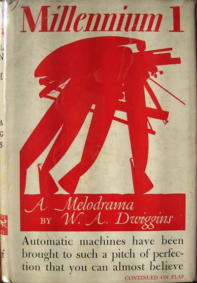
Post Modernism didn't have much impact on graphic design until the 1980's. Initially many designers thought it was just an undisciplined self-indulgence, a hodgepodge of styles with no unifying ideals or formal vocabularies, but in fact it was a new way of thinking about design, one that instigated a new way of designing. Although Jan Tschichold (below) has been celebrated as an early proponent of modernist asymmetric typography, (many designers see his body of work as an important precedent for todays postmodern typography in that it represents diversity in ideology and style) another important precursor to post modernism was W.A Dwiggins.

Dwiggins (below) was a tireless experimenter with form who took inspiration from eastern cultures, history and new technology. Unlike Tschichold, Dwiggins never embraced the Modernist movement nor was he defied by it. However he was absolutely commited to being a modern designer. Both Dwiggins' and Tschichold's work was initially misrepresented with Tschichold being celebrated as a modernist typographer which downplayed his more substantial body of design and writing based on traditional and classical ideas and Dwiggins being represented as a traditional designer in spite of the innovative and experimental nature of most of his work. It has only been in recent years that discussions of both designers have expanded to include the full scope and plurality of their work.

This is because the Postmodern context has encouraged diversity and complexity and the line dividing modern and classical, good and bad, new and old has become very blurry and fractured. In the late 1980's an anti-aesthetic impulse emerged in opposition to Modernists 'good design', a reaction against the narrow and formalist concerns of late Modernism. The new aesthetic was impure, chaotic and crude and was so successful that, in terms of style pretty much everything was allowed in the professionalized filed of graphic design and typography would also go along with this.
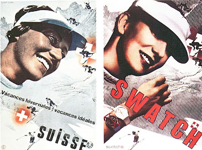
By the mid eighties Paula Scher had become known as a designer producing original and inventive work which often reflected the past. The Swiss watch company Swatch asked Scher and her business partner Terry Koppel to help promote the Swiss watch company. They were asked to develop a campaign that was reminiscent of American 1950's advertising.
Swatch's head quarters was in the Swiss international business building where upon the walls hung the work of Swiss designer Herbert Matter. His style was fresh using contrasting photos, typography and colour he developed a series of powerful posters for the Swiss National Trust Office (Above). Fifty years later Scher held admiration for these pieces and decided "They were all crying out for a swatch watch". The poster had to have some of the elements re-created. The lady in the ski hat was a reshot at a different angle, with the title changed and made bigger and the arm dropped in.
Designers were beginning to push aside context and look at things through a narrowing view of retrospect and nostalgia.
But does Paula Scher get away with this design because she is Paula Scher, because of her reputation, because she was one of many doing it? What role does design history play for us today? I want to question and investigated this myself through this project as appropriation played a big role in post modern design and is one that i feel drawn to.